


دسته بندی: تبلیغات
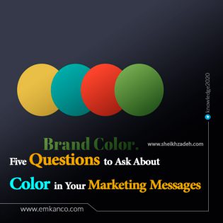
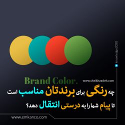
5 Questions to Ask About Color in Your Marketing Messages
Pantone has named Marsala—“a naturally robust and earthy wine red”—as its official color of the year for 2015. Last month, the Color Marketing Group revealed the four colors researchers forecast will be popular in 2016 and beyond.
In North America, “uni-blue,” which is described as an androgynous blue, is expected to be hot. In Europe, it will be “brave,” a warm red. In Asia and the Pacific, “naturban,” a natural green, will be popular, while in Latin America, “maiz,” a soft yellow, will be trending.
What does all this mean for public relations professionals?
In her 2006 book “Color: Messages & Meanings,” Leatrice Eiseman advises communicators to use the same colors in all of their messaging, from print materials to websites.
برای مطالعه ترجمه فارسی مقاله کلیک کنید.
Here are five questions to answer in order to select appropriate color(s) for your brand:
What emotions do you want to invoke

Eiseman notes that different colors invoke very different emotions. Her book outlines the emotions associated with particular shades. For example, red provokes the strongest emotions. “Whether expressing danger, celebration, love or passion – lipstick reds, scarlet and crimson will not be ignored.” Therefore, you should consider the emotions you wish to invoke in your audience, and select colors that will reinforce them.
What shades are “on color” for your industry
In a 2005 study, Mubeen Aslam notes:
In the U.S., blue is associated with toys, health foods, dairy foods, desserts, and financial services; red is related to toys, pizzas, meat entrees; silver is related to dairy foods; green to health foods, vegetable entrees, toys and financial services; yellow to dairy foods, health foods, desserts, toys; and pink to cosmetics and Barbie.
برای مطالعه ترجمه فارسی مقاله کلیک کنید.
Pay attention to the color schemes associated with your industry, so that you do not pick a shade that strikes audiences as unnatural for your brand.
What is your brand personality

In his 2003 book “United We Brand,” Mike Moser argues that simple colors, such as the eight colors used in the original box of Crayola crayons, convey brands that are “aggressive, loud, or dynamic.” Brands such as Jamba Juice, McDonald’s, and Toys “R” Us use those colors.
Brands seeking to convey more sophisticated qualities, such as elegance and intimacy (for example, Armani, Tiffany, and Jaguar) branch out into richer colors, such as those used in a box of 64 Crayola crayons. Moser recommends that “if your brand personality is a little more reserved and thoughtful, then sophisticated colors will reinforce those qualities.”
What colors are associated with the competition
Moser also notes that distinctive colors help consumers spot a Shell gas station as they exit the freeway or a can of Campbell’s soup from the opposite end of the supermarket aisle.
Colors also promote brand recall. Eiseman notes that the use of color can increase learning, retention, and recall by up to 78 percent and boost recognition by up to 87 percent.
You can distinguish yourself from your competition with color. Think, for example, Pepsi blue versus Coca-Cola red.
Do your colors obscure your messages

In his 2011 bestselling book “Thinking, Fast and Slow,” Nobel prize-winning psychologist Daniel Kahneman offers the following advice to communicators: “If you use color, you are more likely to be believed if your text is printed in bright blue or red than in middling shades of green, yellow, or pale blue.”
Indeed, in a 1999 study, Rolf Reber and Norbert Schwarz found that college students were significantly more likely to believe that statements that a particular city was in a particular town (“Osorno is in Chile”) were true when they were presented in highly visible shades of red and blue than when they were presented in moderately visible shades of green, yellow, and light blue. The finding is part of a significant body of literature indicating that people are more likely to both believe and to like messages when they are easy to process.
Ensure that the colors you select make it easy for audiences to read and understand your messaging.
Source: https://www.entrepreneur.com/article/240654#
برای مطالعه ترجمه فارسی مقاله کلیک کنید.

Visits: 61


ارسال نظر